
TINTO Y TAPAS RESTAURANT BRANDING
TINTO Y TAPAS RESTAURANT BRANDING
Tinto y Tapas es un moderno bar de tapas y vinos español inspirado en la tradición española. Ubicado en una bodega restaurada, marida vinos regionales con platos ligeros. Texturas cálidas, detalles de salpicaduras de vino y elegantes menús crean una experiencia atemporal y fresca: un sabor de España con alma.
Tinto y Tapas is a modern Spanish tapas and wine bar inspired by Spanish tradition. Located in a restored bodega, it pairs regional wines with small plates. Warm textures, wine splatter details, and elegant menus create an experience that feels both timeless and fresh — a taste of Spain, poured with soul.
-
![]()
Logo
-
![]()
Window Signage
-
![]()
Indoor Signage
-
![]()
Logo Draft (1)
-
![]()
Logo Draft (2)
-
![]()
Logo Draft (3)


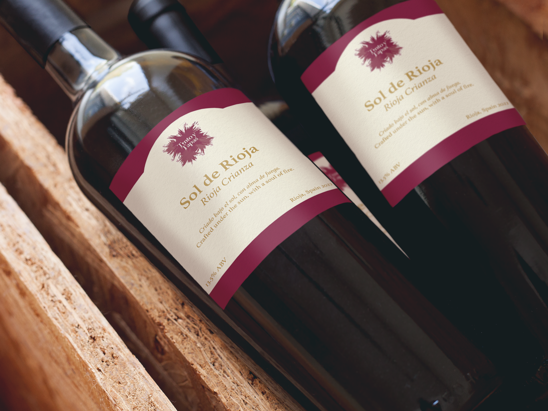
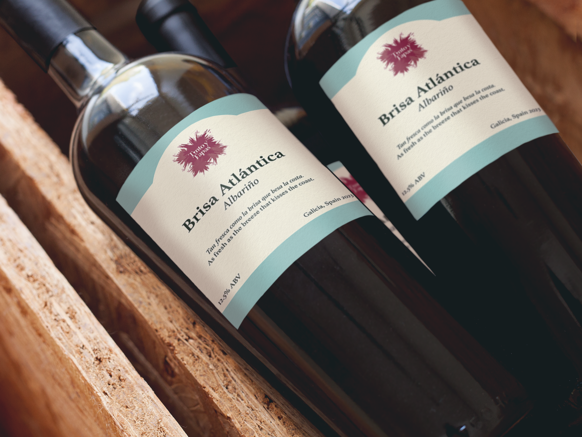
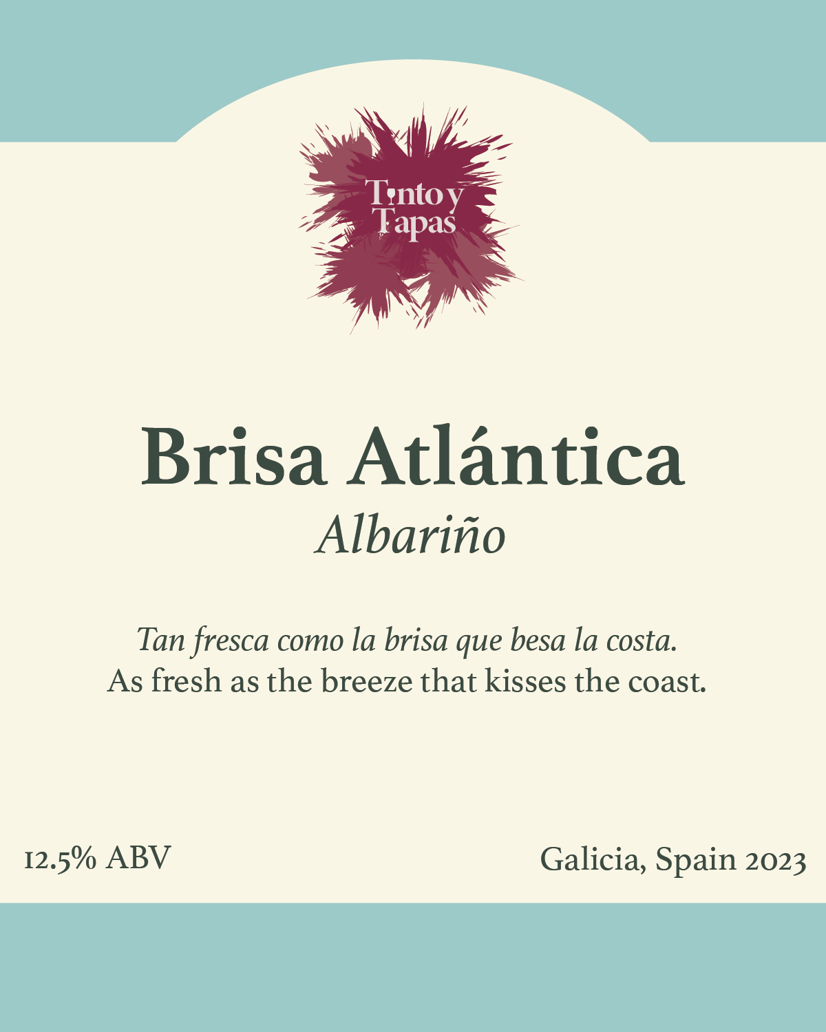
Inspired by sunlit vineyards and rustic Spanish charm, Tinto y Tapas’ color palette blends deep garnet reds and warm terra-cotta. These rich colors create the warmth of shared meals, aged wine, and timeless tradition.


For Tinto y Tapas’ logo, Minion Variable Concept offers a balance between tradition and versatility. With its classic serif structure and subtle modernity, the typeface evokes the elegance of old-world Spain while remaining adaptable across digital and print. Its warm, literary feel pairs beautifully with the brand’s poetic tone — capturing the soul of a timeless wine bar with a contemporary edge.